
Adogi supports ethical pet adoption processes by making rehoming pets easier, while maintaining the trustworthiness of traditional adoption avenues.
This project was designed for the semester-long User Experience Design course atOlin College of Engineering.I worked in a team of 5 engineers to design a product that solved a chosen problem. You can view our project site here and view our final prototype here.
Design an app that encourages users to spend time evaluating their personal fit with a potential pet or potential future owner, rather than matching based on appearances.
UX Designer & Researcher
My specific design flows: Account Creation & Verification Flow, Pet Browsing Flow, Edit User Profile Flow.
Currently, the adoption process frustrates many potential pet owners and it results in people opting for buying from unethical breeders, and people who adopt spontaneously and are looking to rehome their pets. Thus, many pets are harmed or abandoned during and/or after adoption, if they are even adopted at all.
Our solution is the Adögi app, which aims to make the adoption process easier and faster for shelters, pet rehomers, and potential pet owners by providing a platform for both parties to meet with standardized information to help each find the perfect pet/perfect home for a pet. Post adoption, our platform provides pet owners a place to hire animal-loving caretakers for pet-related services.
We have 3 main stakeholders: current pet owner (individual/shelter/rescue), prospective pet owner, and the pet. For this app concept, we will focus first on the user experience of potential pet owners.
For people looking to adopt pets or rehome pets, our app is an accessible and efficient way to connect suitable adopters with their perfect pets according to their preferences.
Unlike animal shelters, our adoption process connects potential pet owners and pet re-homers/shelters with only those who match each party's requirements and preferences to expedite the search and approval process.
Unlike current pet-finding apps, our app creates an extended ecosystem where pet-owners can find pet-lovers to care for their pets while they are busy or away. This allows pet-lovers a platform to find animal-related jobs, as well as making pet caretaking easier while encouraging pet owners to keep their pets when they get busy to discourage more rehoming.
How can we make the process from adopting to owning a pet a more exciting, pleasant, and familiar/friendly experience?
Project goal & brief
We wish to pursue three avenues: adoption, pet sitting, and community building. Our end goal is to create an app that connects pet owners and animal enthusiasts that are looking to adopt, work, and/or play to build a sense of community.
1.) For people who want to adopt a pet, we seek to facilitate and streamline the adoption process and familiarize them with potential pets, lowering the barrier of entry to the pet care ecosystem.
2.) For pet owners/shelters that want to put their pets/litters up for adoption, we seek to provide a simple and easy way to promote their pets and make it a painless process.
3.) For pet enthusiasts looking to interact with pets, we seek to better engage workers with owners and create meaningful experiences on both ends.
What does our user research tell us about the problem? How can we apply this to our app experience to mediate their pain points?
User research, customer personas, user experience map, task decomposition, problem statement, solution, value proposition, & competitive research
To understand the current adoption & rehoming process better, as well as our target customers' past experiences with the system, we distributed a preliminary survey to identify core problems.


We discovered that both pet adopters and owners valued the personality and fit of potential pets and owners, but the process of finding the right "fit" was long, tedious, and depended heavily on who they could find.
We wanted to make this search for the perfect fit easier and less time consuming so that more pets and potential owners would be exposed to each other, regardless of their limited circles, so that more existing pets could find their perfect homes and potential owners would not turn to unethical breeders.
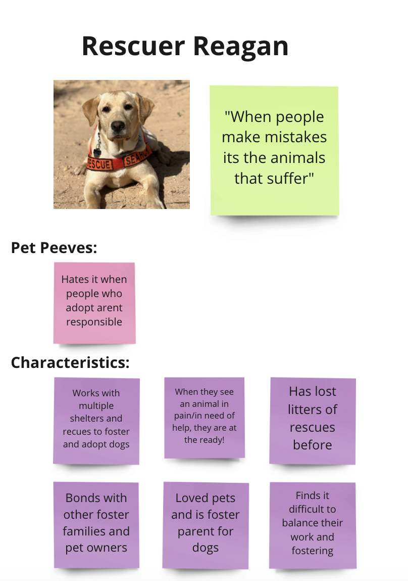
We created personas based on the demographic and qualitative results from our survey. We used these to guide our designs for both potential owners and current owners, keeping in mind their motives, pain points, and shortcomings so that our product was focused on the user.

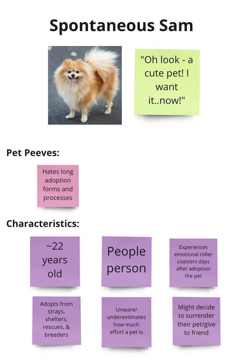
A potential owner who needs the perfect pet, and is frustrated by limited options.
A potential owner and rehomer who is constantly looking to adopt, and is frustrated by long processes.
A potential rehomer who takes in strays and tries to find the perfect new home for them. Is frustrated by irresponsible owners and potential owners.
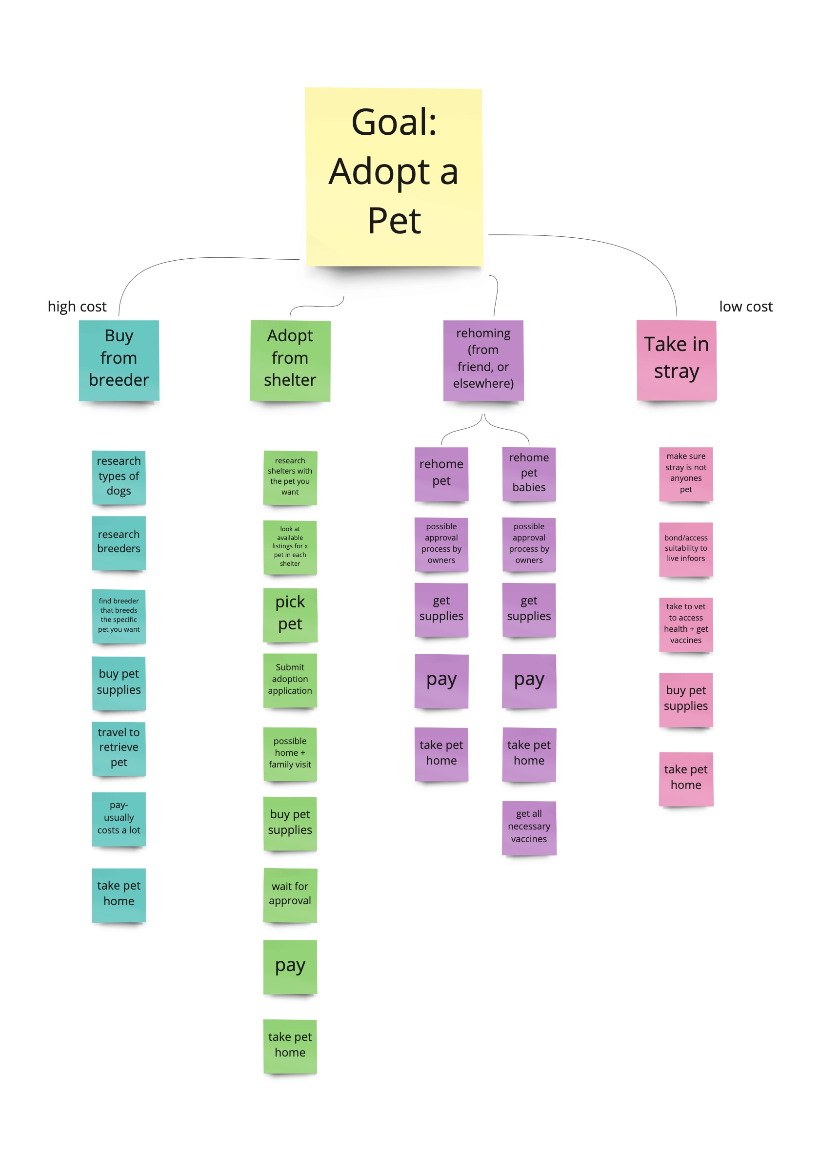
We created a user experience map and task decomposition to track the process of adopting a pet, and how a potential owner feels during the experience. We used these to ensure that the "happy" parts of the process were emulated in our designs, while elevating the "unhappy" parts. We also used these as a guide to compare our final mockups against to ensure the user's goal is acheived.

A hierarchical model with a breakdown that includes a series of sub-tasks with the root task of adopting a pet.
Pet Finder is is a mobile app that aims at finding the perfect adoptee dog or cat that best matches the person in search of adopting a pet. This was an app that the team discovered might have the most in relation to the adoption user demographic that we are investigating. We noticed that while the overall concept is similar to our intended experience, there are a vast amount of opportunities for improvement with responsiveness, affordances, and overall UX for the matching of an actual pet depending on the user. There is opportunity to play around with the way animals are viewed (Instagram-like feed vs. dating-app feed), so we are interested in finding the best way to have our users browse animals that might fit their criteria - is it more of an exploratory process, or a match? Is it nice to have both? Does one promote more excitement over the other? These are questions that we may need user feedback on once we are able to deliver initial prototype designs.
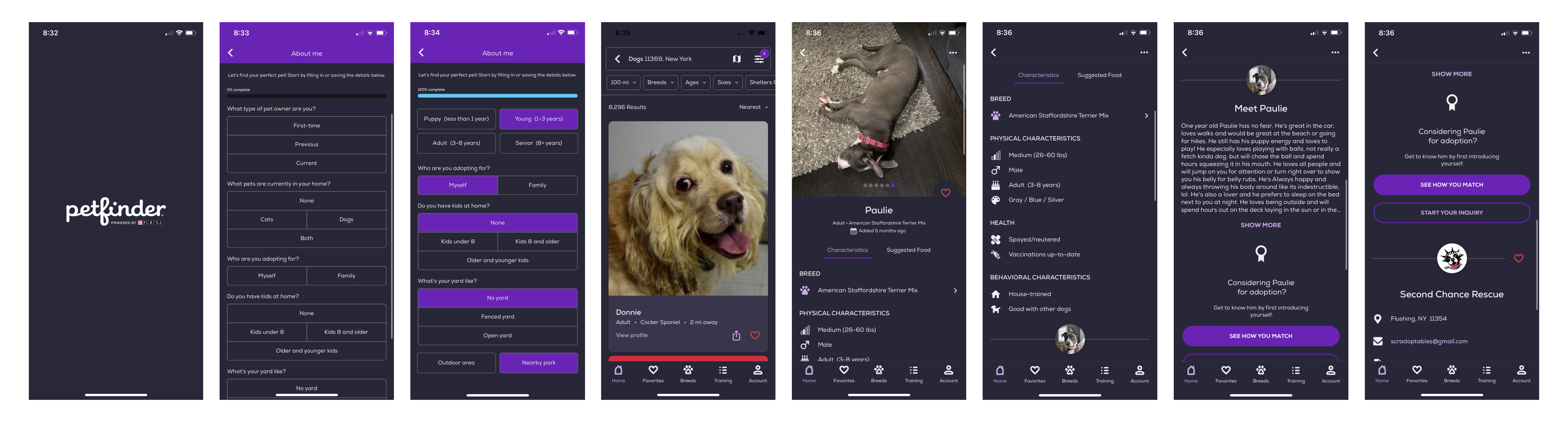
• Showcases pet pictures really big
• Lots of information about the pets
• Shows why user and pet match based on preferences
• Information overload and unresponsive onboarding
• Confusing to navigate (lack of signifiers & exitways)
• Only surface-level profile questions
What features do we absolutely need to meet customer expectations? How do we deliver a user experience that is easy to use but does not sacrifice the thoroughness of the traditional adoption process?
Design inspirations, initial sketches, interaction flows, wireframes, Lo-Fi Designs (Paper Prototypes), focus group testing


Petfinder
Wag
Tinder
Hinge
Enjoyed the pet profile and detailed matching experience.
Enjoyed the human profile and detailed matching experience.
Enjoyed the swiping feed and ability to send "super likes."
Enjoyed the "liking" and adding prompts features.
Using Miro, we devised a basic flowchart of features and pages that would be valuable for users based on the research found. Due to time constraints, we decided to focus on the experience of a potential pet owner and the pet adoption experience, since potential pet owners were our primary stakeholder and the browsing/adoption experience was the main part of the app design.

Our initial sketches explored the different ways we could present a cohesive app experience. At first we considered experiences similar to Instagram, Pinterest, and Tinder/Hinge. We eventually settled on a Tinder/Hinge experience to promote the "matching" concept as well as more likelihood of matches being made rather than just potential pet owners scrolling without a call to action.


Initial app loading wireframe
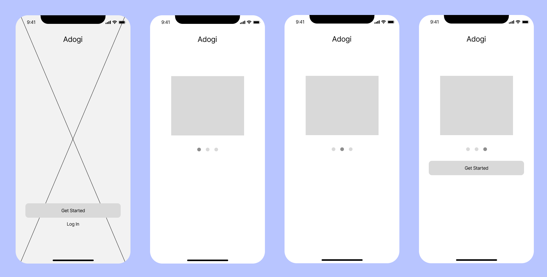
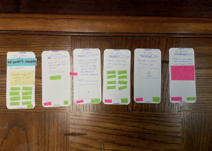
Onboarding experience wireframe
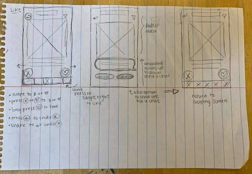
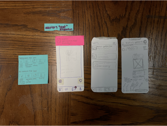
Based on our wireframes, we used notecards to refine how we wanted the interactions to look like through specific design atoms. We focused on where to place entry and exit points between different flows to create the most seamless and easy-to-use flows.

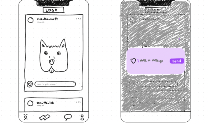
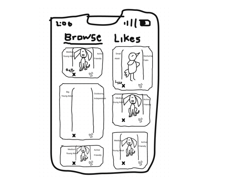
Pet owner's adoption flow

Opening screen flow
Chat flow
Overview of all prototyped flows
Based on our lo-fi user prototypes, what flows work well, and which hinder the user experience? How can we improve the flows to help users complete their goals easier?
Refinement brief, hi-fi prototype flows, reflection
As was mentioned tin the previous stages, our design for the Adogi app takes a substantial amount of influence from dating apps such as Tinder, and considering this we aimed to follow most of the conventions that dating apps tend to be built by, such as the “swipe right means yes and swipe left means no” feature that is so common to these apps. Additionally keeping in mind that we wanted to aim for a streamlined onboarding process we also took the time to design out two different incarnations of what an expedited onboarding experience would look like for a user looking to adopt a pet. We initially believed that the user experience we created was fairly intuitive, and by most metrics it was, but between the move from paper prototypes to Figma flows, we had to abstract some of our original concepts.
From this class, I learned how to bring an idea from the brainstorming phase to conception via Figma, while keeping the design user-focused by constantly referring back to the customer personas. By using these personas to guide the design, we were forced to think about how certain placements of buttons and text would affect the user experience, and if this impact would further or impede a potential user from completing the core goal of the app.
I also learned how to use heuristics to evaluate the atomic features of the app, which kept me mindful about maintaining current conventions already seen in mainstream apps, as well as remembering to provide exit ways to give users a sense of control during their experience.